
It started with a red couch. Just one. I didn’t even mean to buy it—I thought it was burgundy but lighting in warehouse stores is… deceptive. Anyway, I got it home and suddenly boom, my neutral living room was looking very “vampire dinner party meets retired stage actress.” I panicked for like 3 minutes and then leaned all the way in. Red couch, red accents, red living room ideas on repeat. And now I can’t go back.
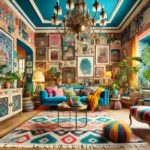
If you’ve ever daydreamed about a moody living room or caught yourself saving pictures of eclectic living rooms with bold red accents (like… same), this one’s for you. We’re talking red couch living room drama, red and gold living room glam that would make Liberace jealous, and red aesthetic living room looks that don’t hold back. And if you’re brave enough for a red accent wall? Get ready to feel like the main character, because red doesn’t exactly whisper.
I’ll admit it—I didn’t expect red interior design to become my entire personality. But here we are. From velvet couches to patterned ottomans to that one gold light fixture that looks vaguely cursed but somehow works… it’s kinda magical. Red is bold. Red is dramatic. Red is definitely not safe. And I think that’s the whole point.
So yeah. I fell into the red living room hole and dragged half my apartment with me. Let’s talk statement pieces, accidental design wins, and a few mistakes I’m just gonna pretend were intentional.
Red Living Room Ideas


")


Paint color combinations that won’t trigger your blood pressure
Red on the walls is a bold move—like spicy mustard on fries level bold—but pairing it with the wrong paint? That’s a fast track to feeling like you’re living inside a fire truck. Deep cherry red, burgundy, and maroon living room tones need balance. Warm white? Good. Creamy taupe? Better. Pale gray? Great if you’re trying not to melt.
But please—stop pairing red walls with bright yellow unless you’re running a fast food joint out of your living room. Try grounding the walls with moody baseboards, or go dramatic with charcoal ceilings (yep, ceilings). It’s weird until it’s genius.
Furniture styles that actually vibe with cherry red
I once tried putting a farmhouse style beige couch in a red living room. I have regrets. Modern styles, vintage flair, even earthy living room vibes can all handle the heat of red—but the furniture’s got to have some edge.
Think:
- Velvet couch with jewel tones
- Red vintage couch living rooms with gold feet (very fancy grandma energy)
- Curved backs, tufted buttons, maybe something mid century if you’re feelin’ trendy
The key is matching drama with drama. If your walls are intense, your couch can’t be shy.
Lighting choices that won’t make your red walls scream horror movie
Bad lighting in a red room is…a jump scare. Like, “why does this feel like a haunted theater?” kind of jump scare. You want gold light fixtures or something soft and glowy. Definitely not the bright overhead hospital-style bulbs that make everyone look slightly possessed.
Warm lighting with dimmers is your best friend. Layer it up:
- Floor lamps with gold or brass finishes
- Statement chandeliers for maximum drama
- Small table lamps that glow like a cozy fire, not a horror film waiting to happen
Mixing finishes—because glossy, matte, and velvet can coexist
Let’s talk finish mixology. Glossy surfaces bounce light. Matte absorbs it. Velvet? Velvet just sits there looking smug and expensive. But in a red living room, you need all three to stop the space from feeling one-note.
It’s not about making it match. It’s about making it feel layered. Go ahead:
- Matte red walls
- Glossy gold coffee table
- A velvet armchair that you name and talk to (or maybe that’s just me)
Texture is your secret weapon here. Even a patterned ottoman counts as a win.
Red Couch Living Room


")


Which shade of red says ‘bold’ versus ‘bless your heart’
This one’s personal. I once bought a couch that was supposed to be crimson. It showed up as something closer to “pepperoni grease.” Not ideal. The thing is, not all reds are created equal.
- Cherry red is a head-turner
- Burgundy is mature and brooding (like that professor who drinks too much wine)
- Maroon feels deep, confident, and lowkey mysterious
- Bright scarlet? Bold, but also… kind of a lot
Pick your red based on the energy you’re going for. Unless that energy is “oops,” in which case, welcome to the club.
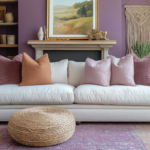
Layering in neutrals without looking like you gave up halfway
Red couch? Great. But now the rest of the room’s gotta step up. Tossing in random small living room neutrals with no game plan can make it feel like you just gave up halfway through a design show challenge.
Here’s the trick:
- Stick to earthy tones like clay, sand, or deep gray
- Add textures like linen, rattan, or chunky knits
- White and red living room combos? Only if you want peppermint vibes (and not in the cute way)
Neutrals should support the couch, not apologize for it.
Pillows, throws, and accidental blanket hoarding
If there’s one thing a red couch living room deserves, it’s an avalanche of textiles. And no, there’s no such thing as too many throw pillows.
Mix:
- Patterns (stripes, florals, abstract blobs—whatever)
- Materials (cotton, faux fur, cable knit)
- Shades of red, burgundy, rust, and maybe one red and gold living room pillow just to be extra
And don’t worry if it starts looking like a small, stylish pillow fort. That just means you’re doing it right.
Coffee table styles that don’t clash with your red couch drama
There’s a fine line between “cozy contrast” and “what in the mismatched furniture is going on here.” Your coffee table should complement the red couch, not compete like it’s auditioning for the lead role.
Try:
- Gold side table or gold coffee table for glam vibes
- Deep walnut or espresso wood if you’re more earthy living room than flashy
- Sleek black for drama
- Glass if you’re into the whole “I pretend I don’t have kids or pets” fantasy
And maybe keep a statement wall art piece nearby to pull it all together. Or distract guests from the crumbs.
Red Living Room Decor


Statement wall art that doesn’t try to compete with the couch
Look. If your red couch already walks into the room like it owns the place, the wall art behind it doesn’t need to scream louder. It’s not a competition. It’s an ensemble cast. Let the couch be the diva.
Choose statement wall art that complements, not overpowers:
- Muted tones with interesting shapes
- Textural pieces (think linen or wood over loud canvas prints)
- Abstracts in cream, charcoal, or gold that add interest without starting a shouting match with your furniture
This isn’t HGTV Fight Club. You don’t need every piece trying to be the “focal point.”
Rugs that ground the space and your emotional instability
Red rooms can feel like they’re floating in space—beautiful, dramatic, but a little unhinged. A good rug brings you back to Earth (and maybe keeps you from rage-cleaning).
For a red living room, skip neon and lean into:
- Deep, earthy rugs with burgundy or brown woven in
- Classic patterns that don’t steal attention but still hold their own
- Textures like jute or thick wool to balance all the velvet, gloss, or leather you’ve probably got going on
Bonus: A big rug hides questionable life decisions and also crumbs. Very useful.
Gold accent pieces that feel ‘old money’ not ‘Las Vegas’
We need to talk about gold living room decor. Gold can either whisper “vintage heiress with a trust fund” or shout “I won this at a casino in 2002.” The line is very thin.
Do this:
- Gold side table with a patina finish
- Gold light fixture that looks like it could hang in a historic theater
- Picture frames with subtle detailing, not glitter crusted dragons
Don’t do this:
- Giant mirrored gold sculptures unless you’re legally Beyoncé
- Anything that reflects so much light you need sunglasses indoors
The goal is glam, not gaudy. Think gold living room sophistication, not accidental theme party.
Curtain choices—thick and theatrical or light and breezy?
Curtains can take your red living room from “Oh wow” to “OH WOW,” depending on the vibe. Thick velvet drapes? Drama queen. Light linen panels? Chill boho cousin.
Both work. But pick a lane:
- Theatrical: Go floor to ceiling with burgundy or deep gold. Add tassels if you dare. Lean into that moody living room vibe.
- Breezy: Soft white or oatmeal, sheer enough to let in light but still frame the window like it matters
Curtains are like eyeliner. They can either sharpen or soften your whole look.
Red Living Room Aesthetic


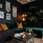
Balancing moody and cozy without tipping into vampire castle
There’s moody… and then there’s candelabra and coffin corner moody. A moody red living room can be cozy or creepy. The difference? Warmth. Layering. Lighting that doesn’t make you question your life choices.
Here’s how to not become Dracula:
- Add soft red decor like throw pillows in mixed textures
- Bring in earthy living room elements like wood or greenery
- Use warm, layered lighting and for the love of design, avoid pure white LED bulbs
You want intentionally dramatic, not accidentally haunted.
How to use maroon without spiraling into 90s basement territory
Maroon is tricky. It’s like the forgotten cousin of red living room shades. Done right, it’s deep and rich. Done wrong, it’s a carpet stain from 1994.
Keep it feeling current with:
- Pairings like charcoal gray, cream, or tiny pops of gold
- Mixing it into red accent decor rather than painting the whole room
- Anchoring it with sleek or modern pieces, not puffy couches with wood trim (please no)
Think burgundy interior design, not “mom’s basement makeover gone wrong.”
Playing with texture—because red + flat = meh
Flat red is just… red. But layered red with velvet armchairs, chunky knits, smooth ceramics, and maybe a patterned ottoman? Now we’re talkin.
Start stacking:
- Velvet (yes, again)
- Leather or faux leather for contrast
- Wood with warm tones
- Glass or stone for some hard surfaces
You want guests to want to touch everything, not back away slowly like they just entered a wax museum.
Styling shelves without your red accents looking like a crime scene
Shelves in a red living room are tricky. Add too much red? It looks like someone lost a bet with ketchup. Too little? The room feels disjointed.
Tips to not commit shelving crimes:
- Use red as a connector—like one or two red decor pieces per shelf
- Balance with books in cream, black, or gold
- Vary the height and material so it’s not a red blob
Also… leave some space. It’s okay. Your shelves don’t need to hold your entire personality.
Red and Gold Living Room


Why gold lighting is basically the highlighter of interiors
Gold lighting is the main character energy your red living room didn’t know it needed. It’s the highlighter in your makeup bag, the cinnamon in your coffee, the sparkle that says yes, I meant to do this. Especially when the red is rich and moody, gold light fixtures don’t just add light—they add drama.
You want fixtures that glow, not blind. Try:
- Soft brushed gold chandeliers with round bulbs
- Sculptural table lamps that look expensive (even if you found them secondhand next to a lava lamp)
- Wall sconces in antique gold if you’re feelin’ a little bougie
Think “elegant vampire lair” lighting. Not tanning bed chic.
Furniture finishes that look intentional (not just clearance aisle finds)
If your red and gold living room starts looking like every piece was adopted from a different decade with no supervision… we got a problem. But the right furniture finishes pull everything together like they belong at the same fancy dinner party.
Stick with:
- Warm woods (think walnut or cherry)
- Brass or soft gold legs or handles
- Upholstery in deep tones—burgundy, clay, charcoal, maybe even dark emerald if you’re feeling wild
Avoid anything too chrome. Or fake glass. Or that weird gold plastic that flakes off when you blink too hard.
Layering metallics like a responsible adult with a sparkle addiction
It’s possible to be both obsessed with shiny things and still have taste. Promise. If you’re into gold living room accessories but also kinda love silver or copper, don’t panic—you can mix. But like, thoughtfully. Like you mean it.
Here’s how to keep it classy:
- Keep one metal dominant (hint: gold)
- Use others sparingly, as accents or contrast
- Repeat each finish at least twice so nothing feels random
You’re going for intentional layering. Not “I panicked at HomeGoods and blacked out.”
Subtle red and gold combos that don’t scream “holiday every day”
We’ve all seen the red and gold combo that looks like Christmas threw up. But it doesn’t have to be that way. You can use these colors together without your living room smelling like cinnamon and regret year round.
Here’s the cheat code:
- Go muted: burgundy instead of fire engine red, antique gold instead of glitter
- Add in a third color like soft white, deep green, or brown
- Let textures do the work—matte red with brushed gold feels luxe, not festive
If someone walks in and immediately starts humming carols… tone it down.
Burgundy Interior Design


Using burgundy as the deep, rich cousin of cherry red
Burgundy is cherry red’s older, moodier sibling. The one that listens to vinyl, drinks wine with unpronounceable names, and wears linen year round. And in burgundy interior design, that vibe carries. It’s grounded. It’s plush. It has feelings but doesn’t need to talk about them.
Use it in places that need warmth without shouting:
- Accent walls
- Sectionals
- Red decor elements with more depth
It’s rich and serious, but like… in a cozy sweater kind of way.
Accent chairs that scream style but also whisper “nap here”
There’s a moment when you find the accent chair that looks like it came out of a magazine but feels like a nap trap—and you buy it anyway. That’s the dream. Especially in a red living room that’s already extra, the accent chair is your chance to chill the energy just a little.
Look for:
- Deep burgundy velvet with curved arms
- Tufted backs, wide seats
- Maybe a bold gold leg or two, just for sparkle
You want your guests to sit down and say, “Oh no… I’m never leaving.”
Pairing burgundy with charcoal or cream (not both, you wild child)
Burgundy is powerful. Charcoal is brooding. Cream is soft. Put all three together and your red living room might have an identity crisis. Pick one neutral, then commit.
- Charcoal makes burgundy feel modern, a little edgy
- Cream softens the space and adds light
- Use gold as a thread between them if you’re desperate to break the rules (I won’t tell)
Just… don’t throw all three in with no plan. It gets weird fast.
Floor and wall pairings that won’t suck the light out of the room
Dark red and dark floors? Bold. Risky. Sometimes a little… dungeon-y. Unless you’re actively auditioning for a gothic romance, you need contrast. Balance is everything.
Try:
- Red hardwood floors with pale walls
- Burgundy walls with medium wood or light-colored rugs
- Gold accent decor to bounce the light around and make it feel intentional
And yes, rugs help. They always help. Even if they’re just hiding scratches and weird stains from the dog.


Conclusion
What started with one red couch turned into a full-blown design spiral—and honestly? No regrets. A red living room doesn’t quietly sit in the background. It takes up space. It demands attention. It’s moody, dramatic, cozy, a little unhinged… basically, it’s all of us on a good day.
From paint color combinations that keep the chaos stylish to red and gold living room accents that somehow whisper “wealth” instead of “Santa’s workshop,” this entire ride has been about finding balance in boldness. And maybe embracing a little drama while we’re at it. You’ve got your velvet armchairs, your gold light fixtures, and possibly a few rugs that are working way too hard to keep you grounded—but hey, that’s part of the charm.
Burgundy, maroon, cherry red—whatever flavor of fire you’re into—it all works if you commit to the aesthetic and layer with care. No more timid neutrals pretending to be edgy. No more mismatched furniture that looks like a garage sale staged a rebellion. You’ve got ideas now. Very good ones. Your red living room is gonna be that space people remember. Or talk about behind your back in jealous tones. Either way—win.
Related posts:
 Red Bedroom Ideas: Stunning Ways to Use Bold & Moody Shades
 41 Eclectic Living Room Ideas that are Joynourmously Maximalizing
 10 Dreamy Lavender Living Room Ideas for a Cozy, Muted Colorful Space
 21 Dark Boho Living Room and Maximalist Decor Ideas That Prove Minimalism Was a Lie
 Moody Living Room Ideas: Transform Your Space with Bold Style and Cozy Vibes